Websites are considered as an integral part of any business. Whether it be an online business or offline, having state of the art website will lead you to gain massive traction. When it comes to the website, 55% of readers stay on the page for less than 15 seconds. You either win the attention of visitor or lose it in mere seconds.
The same goes for a B2B website, leading you to make your first and last impression on the visitors. Attracting potential customers is hard, but not impossible. For this reason, you need to develop a website by avoiding these mistakes. Have a look at some of the top mistakes your B2B website should avoid.
1. Ignoring Responsiveness
People nowadays normally access websites through smart devices like tablets and smartphones. Moreover, Google promises webmasters to make their websites mobile friendly in order to gain better ranking in search engine.
Imagine if a person visits your website on a mobile device to look for a specific solution or product. If the website is not responsive, there is no reason for the visitor to stay on your website. Non-responsive websites will not only frustrate the visitors but also affects the ranking of your website.
If you don’t know how to make a responsive website, you can hire web development services to address all your website needs.
2. Failing to Reflect Your Brand
The purpose of any website is not only to display your products or services but also to maintain brand existence and consistency. No matter what channels you are approaching, you need to align with your brand. It should depict a similar look and feel, representing your brand and its core purpose.
Use your website to show what your brand all about is. In case of B2B website, show how you are different from your competitors and, what are the unique value propositions that out beat your rivals.
3. Ignoring the Page Speed
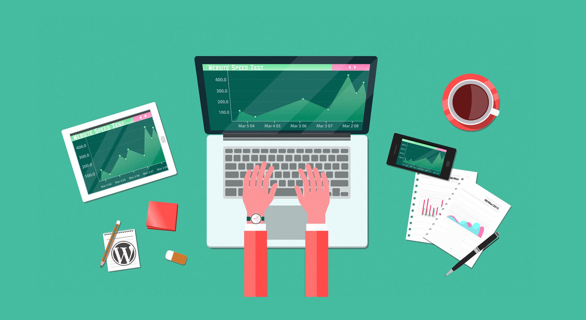
Have you ever visited a website that loads sluggishly? How long will you bear to wait for the website to load? Probably not more than 2 to 3 seconds. Imagine the same case on your website when a user visits your website and the page takes ages to load. No one will stay on your website, no matter what.
Make sure to check the page load speed of your website. If your website contains larger images, resize them and reduce the file size. You can find many free and paid tools to help you resize the image. Moreover, many WordPress plugins also help you to reduce the size of your images and load the website quickly.
4. Not Having Clear Conversion Path
The most important of your website is the Call to Action element. Whatever products or services you offer, if CTA is not clear and does not provide clear instructions, you will not be able to convert the visitors.
Some other elements need to be considered are:
- Writing content around the visitors are interested in
- Landing Page that summarizes the benefits of your product/service
- Call to Action Button to avail the offer
- Form on landing page to be filled and get the download
- Thank you message
5. Lack of Consistency Between Pages
The consistency between pages must be taken seriously. Otherwise, the visitors will either not trust you or will never visit your website again. Make sure to have consistency in every aspect of visual, content, elements on the page and more.
The user interface and user experience also matter a lot when designing pages. Similarly, the content on your blog should be posted on similar days so that everyone knows when your blog post will be updated.
6. Failing to Update
Failing to update your website regularly according to the latest web design trends will stop visitors from visiting your site. It does not mean that you have to update it on weekly basis or every year. The catch is to stay updated with the news and trends and set your website accordingly.
For instance, the menu of the website a few years back was under the head while today, hamburger pulldowns have become popular. Moreover, stay updated with the latest technology as well. More you stay ahead of the competition, the better your business is.


